What is Data Visualization exactly?
If you have surfed the internet recently you surely have seen a map of every state’s favorite band below.
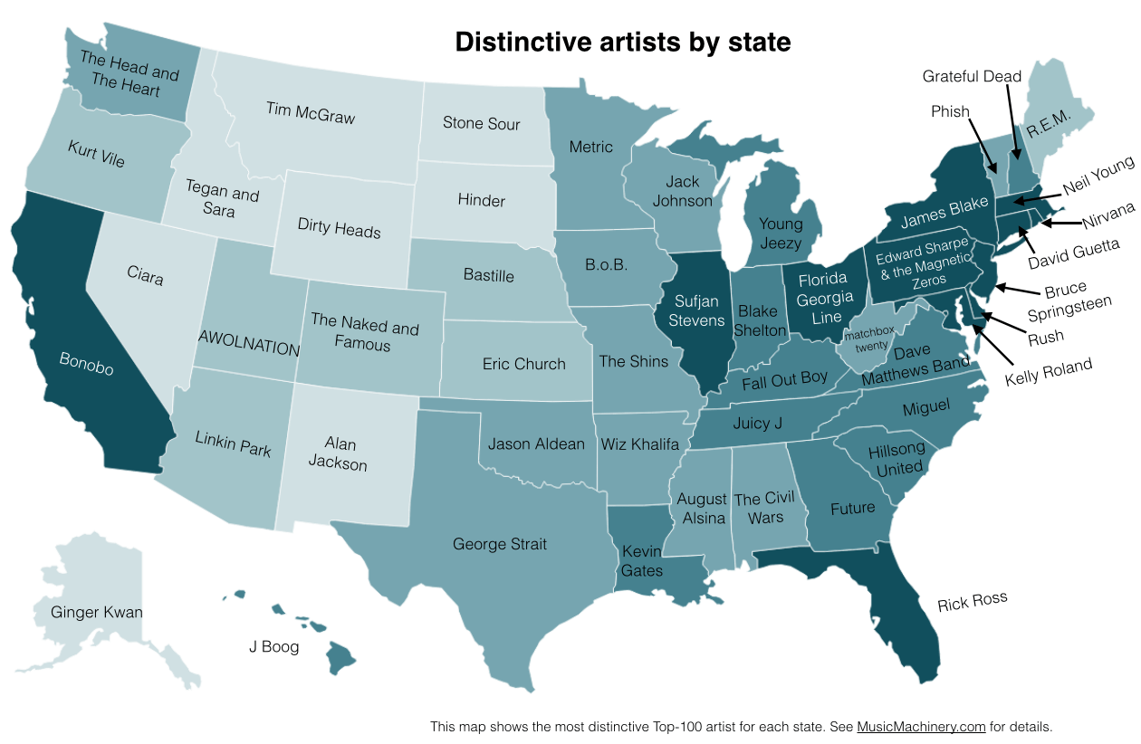
Source: Music Machinery
As more software tools for creating data-driven images becoming available, scientific data may increasingly be represented this way.
This practice is called Data Visualization. But what is it exactly? Simply put, it is the seamless combination of raw data with intuitive graphical representations of the information.
Why the need?
Everyone loves pretty things. Data visualization is an effective way to combine our humanistic desire for beauty, with large chunks of data that are otherwise contextually obscure. Often, statistics presented in basic numerical terms are not tangible. By giving raw data a graphical representation the audience is able to put the statistics in perspective.
Take the state band preference data for example. If you were to see a list of every state’s band preference it may pique your interest, but not impress you enough that you share it with your friends and anyone in your vicinity.
But when you simply overlay the results of the study on a visually striking map of America the data then becomes tangible. Your eyes can scan the page traveling from state to state checking out what their band of choice is.
Examples
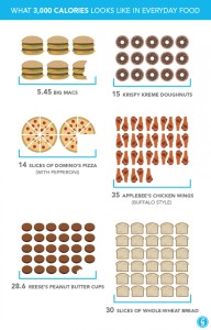 Thanksgiving Feast Visualized
Data visualization gives you the ability to give context to events such as your Thanksgiving Dinner. People gorge themselves on Thanksgiving without a care as to how many calories they are actually ingesting.
After concluding that, on average, people consume 3,000 calories during a Thanksgiving feast it is then possible to apply that data to other eating sprees.
Through this infographic (click to see a larger version) you are able to see how truly ridiculous it is to eat 3,000 calories in one sitting. No one in their right mind should ever eat almost 6 Big Macs, ever. So then why is it ok to do it once a year at Thanksgiving?
Source: greatist
Natural Disasters Visualized
Some data are much more striking when shown visually rather than numerically. The infographic below is a great representation of this approach.
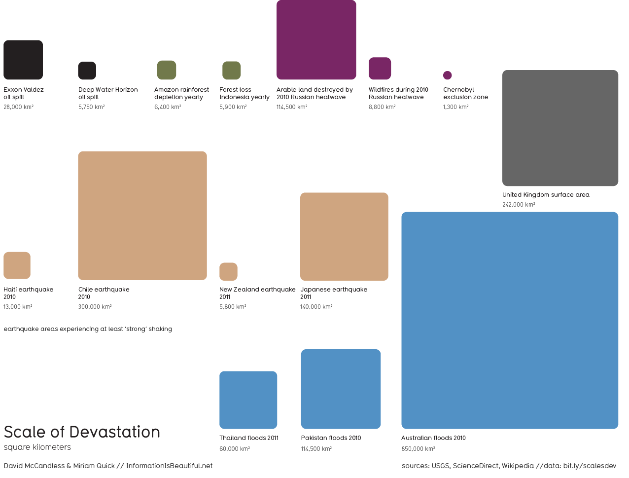
Source: Information is Beautiful
You might be surprised to see that the Australian floods of 2010 have a much larger scale of devastation by land size than any of the other disasters shown, larger than the shocking Japanese earthquake of 2011 for example.
(Another possible option for this graph would be to compare devastation per capita—or economic devastation—of these same natural and man-made disasters. It would be interesting to see if this changed the results.)
3 Things to Remember About Data Visualization
Now that you are familiar with the basics of data visualization lets review some of the main points behind successful infographics.
1. Surprising or unexpected results make for the most interesting data visualization.
2. Keep the graphics aesthetically appealing. This is how you pull your audience in.
3. Contextualize the data. Make sure to give your audience perspective so they can fully understand what you are trying to communicate to them. (Preferably through related relative data points—like the UK Surface Area square in Natural Disasters example above).
Tell us what you think! What are some of your favorite data visualizations?John Stewart is a Marketing Intern for WP Engine. He is a Communication Studies major with a minor in English at TCU and is a rock climbing and music enthusiast.
I must be missing the point. I live in Florida, but never heard of Rick Ross. Yet a local band from Orlando is on the map – Matchbox Twenty – and they’re in the wrong state.
Is the purpose of data visualization to change the facts?
Thanks for your comment William. The purpose of data visualization certainly is not to change he facts! The map shows people’s favorite bands in each state, rather than the state of origin.
-JS